Dust flux, Vostok ice core

Two dimensional phase space reconstruction of dust flux from the Vostok core over the period 186-4 ka using the time derivative method. Dust flux on the x-axis, rate of change is on the y-axis. From Gipp (2001).
Wednesday, September 6, 2023
Open Access Government article goes live
An article I wrote for Open Access has now gone live.
I've just noticed some big changes in google blogging
Friday, May 19, 2023
Your post titled "Deconstructing algos, part 4: Phase space reconstructions of CNTY busted trades suggests high speed gang-bangs in the market" has been put behind a warning for readers
Hello,
As you may know, our Community Guidelines (https://blogger.com/go/conten
We apply warning messages to posts that contain sensitive content. If you are interested in having the status reviewed, please update the content to adhere to Blogger's Community Guidelines. Once the content is updated, you may republish it at https://www.blogger.com/go/app
For more information, please review the following resources:
Terms of Service: https://www.blogger.com/go/ter
Blogger Community Guidelines: https://blogger.com/go/content
Sincerely,
The Blogger Team
Hilarious, considering the article is only about 12 years old
Wednesday, August 5, 2020
The inflationary hyperloop and other tales from the near future
Last time we looked at the recent transition from deflation to inflation as revealed in the USDX vs gold chart. This time I would like to put this into a somewhat larger perspective.
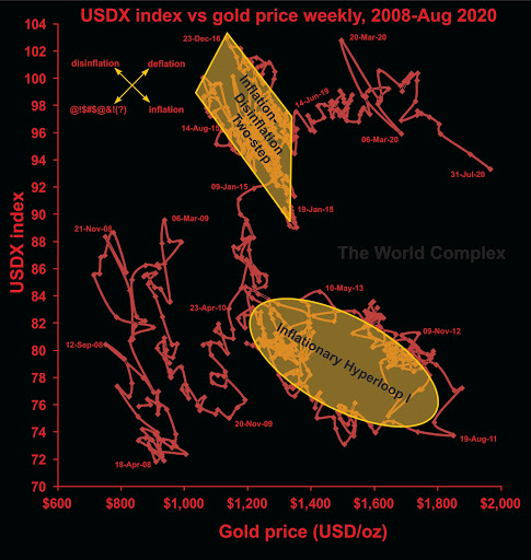

This chart compares the US dollar index with the gold price over the last 12+ years. The overall effect has been one of deflation (both gold and the dollar index have risen over that period), but the effect has not been steady. Much of the deflationary "progress" has been made through cycles of inflation and disinflation, although there have been substantial periods of "pure" deflation, mainly in early 2010, late 2014 to early 2015, and the longest stretch covering nearly all of 2019 into May 2020.
The question of inflation, disinflation, deflation, etc. are not just theoretical--they potentially affect the balance sheets and investors' perception of gold and silver stocks as investments (or, perhaps, speculations). During deflation, when both the US dollar price of gold and the US dollar index are increasing, the balance sheets of non-US-based gold miners (companies with mining operations outside of the US) improve markedly. The effect is not as strong for US-based gold miners, however they do benefit from inflation. During inflation, the non-US-based gold miners don't really benefit much (from the accounting perspective), however this tends to be the time when their perception of value increases the most in the minds of investors. Since it is also likely to be a time for US operations to increase in profitability, it improves the financial conditions of the Nevada-based producers (and California, Arizona, etc.).
Also take note of the effects of deflation on silver. It isn't pretty. The switch from deflation to inflation makes puts silver in play. The important thing to remember is to leave the party when the inflation turns to disinflation or deflation, which can happen suddenly.
In May, the situation switched from deflation to inflation. That may suggest that American-based producers and silver companies are right in the sweet spot.
One feature that stands out is the "inflationary hyperloop" highlighted in gold. It represents a fairly long period of inflation followed a similar period of disinflation, the total lasting about four years. For gold and silver investors, only the first half or so was much fun. Now that we have entered into an inflationary period, are we going to experience another such loop? It seems plausible.
But there is at least one significant differences in the current inflationary run and the beginning of the inflationary hyperloop--and that is battle. Almost the entire way around the loop there was a real struggle between bear and bull forces. That struggle on the way up is important, as it tends to lead to resistance on the way back down. Now observe our current smooth inflationary stretch since May. Where are the struggles?
One approach is to assume that the current situation will mimic the inflationary loop. If so, we might get two years of fun and about $600 of price out of this. Some approaches suggest magnitude and time increase due to [central bank-fueled liquidity; higher price levels; Mars is in conjunction with Apollo; your reason here]. But the reality is that this is a dynamical system, and in state space, once the system breaks out of a mode of stability, it can move rapidly to another. The new area of stability may be nearby, or it may be far afield, but in either case, without any previous observations of its existence, its location in phase space is unknowable. This is just a roundabout way of saying we can't know how high the gold price will go (or how low the gold-silver ratio will fall) during this period of inflation.
I just thought of this. Youtube here
Monday, July 27, 2020
A sharp transition from deflation to inflation
Today's chart is the US dollar index vs gold over the last two years (actually the last 94 weeks, which is not quite two years).
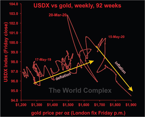
We have discussed why deflation and inflation are not opposites on this graph previously.
Here we see a sharp transition from deflation to inflation, occurring within a week of May 15 (two months ago).
Note that deflation is the best condition for gold companies, in terms of improving fundamental strength. It is possible, however, that many market participants believe that inflationary conditions are better. So strength may continue. Past history shows that inflation may give and take away. When the gold price has risen strongly, governments have often applied "windfall taxes", reducing the real gain experienced by the company. And if gold is rising, while the US dollar is falling, and you are a mining company outside of the US banking US dollars for your gold, what is happening to your real income?
In at least one previous article, we have also discussed why silver is a dog during deflation, but outperforms gold during inflation.
And, as in all cases, let the buyer beware!
Sunday, May 31, 2020
A global pandemic is too dangerous to leave the experts in charge, part 1
As I write I have been in some form of lockdown for about two months, having resisted it for the first couple of weeks. I kept commuting into the office until the very end of March, before retreating to Newmarket and hanging out there for the past couple of months.
I still have had to use public transit to commute to my dialysis centre. The lengthy commute increases my risk level, but I am fortunate to still be well.
Today's comment is about pandemic control. I haven't seen a lot of it, apart from the shutdowns. Unfortunately, we have almost no information allowing us to see the effects the lockdown has had on the spread of the virus, because there has been no organized process of random sampling.
Random sampling is the only way for us to get a handle on the true number of viral cases. For instance, in Ontario, the government is reporting on sample results that are now beginning to reach about 20,000 per day. At the same time, the number of new cases verified through testing is generally between 300 and 400 each day. Given that the sampling numbers are typically around 16-17,000 per day, we may be looking at an infection rate of a little over 2%, which if reflective of the population at large would suggest about 350,000 cases in Ontario--far more than the number of cases that has been identified by testing.
However, we can't extrapolate reliably, because none of the samples are random--they are self-selected for either being at high risk, or because they may have symptoms. It would be useful for us to know the true incidence among the population, because if the number of cases is indeed around 350,000, and the hospital load and death rate have been as we have observed, then this virus is a lot less dangerous than supposed.
We also have no idea of the true trend in the general infection rate--information that would help us assess the effectiveness of the lockdown. In the absence of random sampling, such information will not be forthcoming. What the Ontario Ministry of Health needs are mobile sampling teams that can carry out a randomized sampling program, possibly by going to pre-selected addresses, or possibly some other scheme (a lot of thought has already gone in to taking random samples of Ontario's population--but not by the government).
This is one of the first things that anyone would learn when becoming involved in setting public policy (or marketing public policy). The experts do not appear to have proposed such a program. One has to wonder why.
Subscribe to:
Posts (Atom)